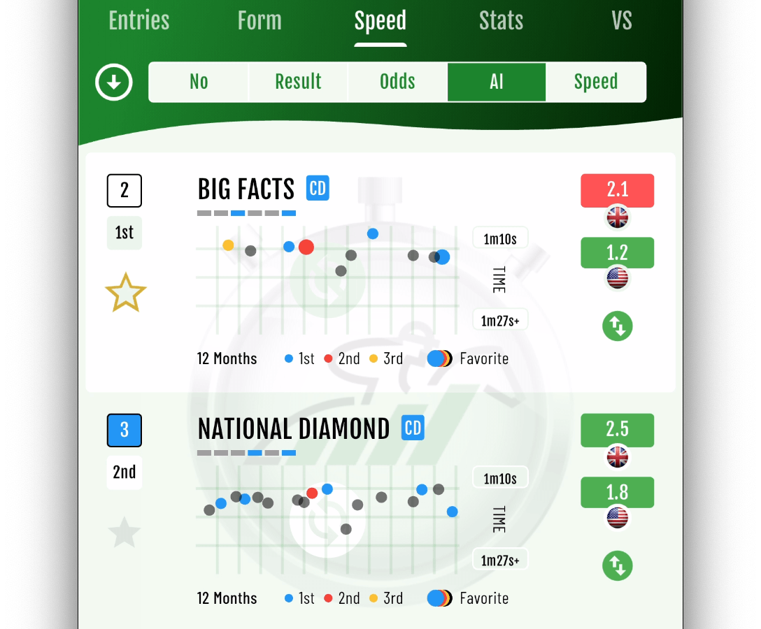
Speed

Speed Charts
The Speed Charts provide a visual representation of our unique global Speed Ratings, calculated from past performances during the selected time period but adjusted to enable comparison with today's race conditions and distance. A smoother chart line indicates consistency.
The circular indicators on the chart represent a predicted finish time had the race conditions been identical to today, and they are color-coded to reflect the actual finishing position in each race:
Blue - 1st
Red - 2nd
Amber - 3rd
Gray - 4th or later position, or did not finish the race
Larger circular indicators identify races where the entry was the favorite to win.
The predicted fastest and slowest winning times are displayed on the right of the chart.
Tap the recycle icon to adjust the past performance period from 3 to 24 months.